FLEX
Magazine Rebrand
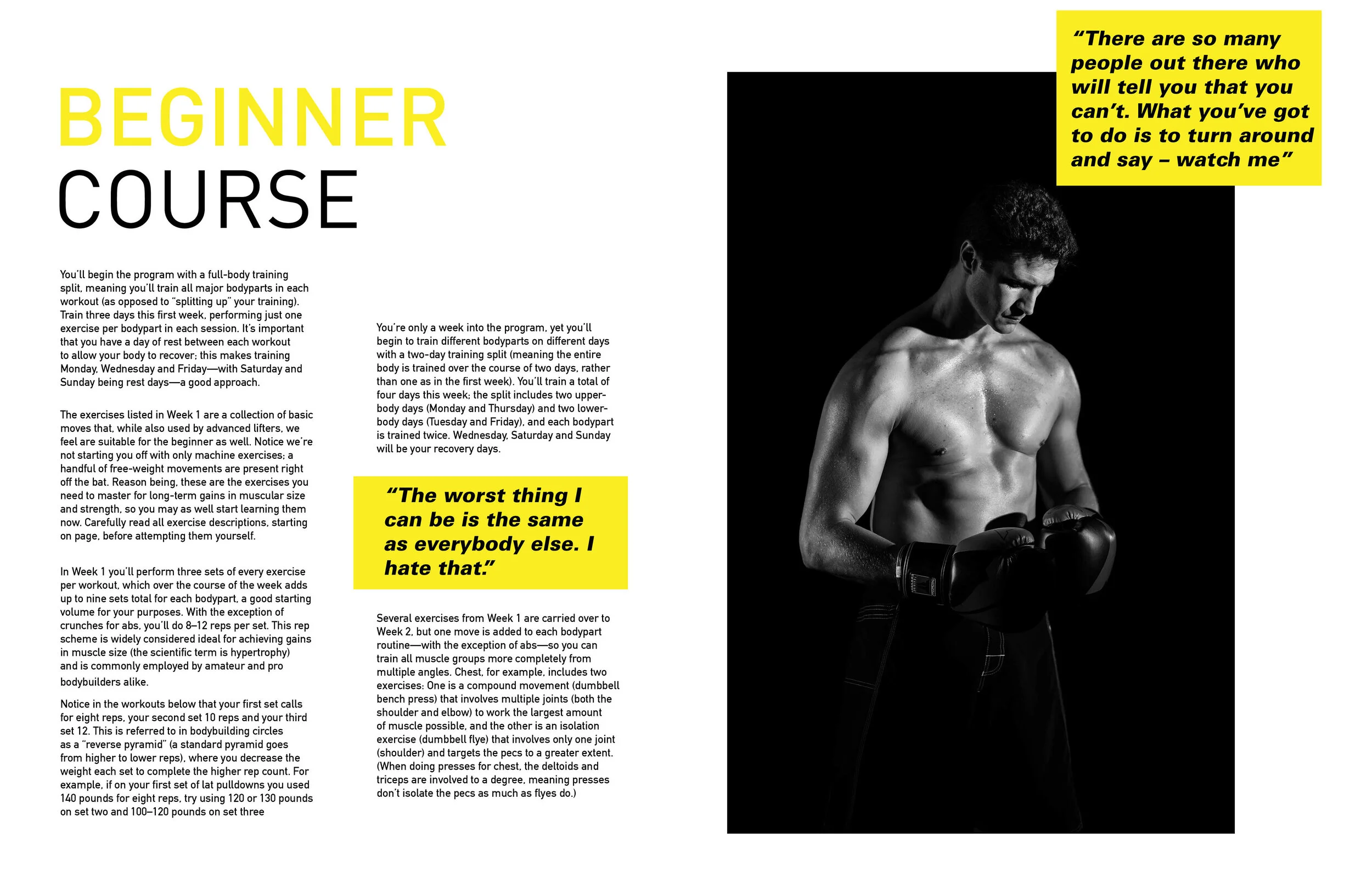
Personal rebrand of a fitness/gym magazine, Flex, as a more contemporary print book and leaving the past clutter of the company's older layouts, with my perspective layouts and tone. The aim was to keep FLEX's core values of muscle and fitness, while still presenting an elegant system.
Maintaining an Identity
The idea of these new layouts, was to convey Flex as a more modern and visually pleasing magazine read. While the enthusiasm of the old magazine was clearly shown in the past; it was cluttered with tension filled typography and clashing photography. My take was to ease the clutter and give a new energy that breathed different. To convey a more sophisticated take on already established print.


